Not a Penny
Not a Penny is an independent online directory for discovering free things to do across cities in the UK, bringing together cultural attractions, public spaces, activities and local experiences without an entry fee.
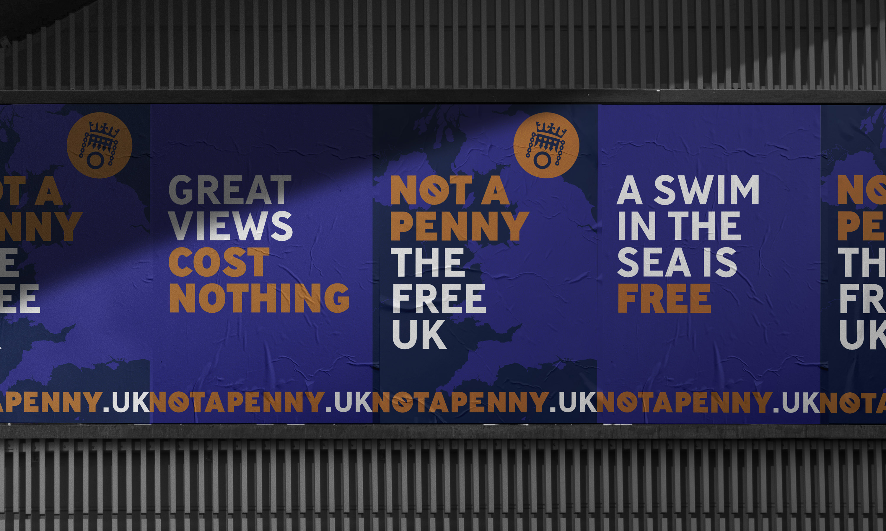
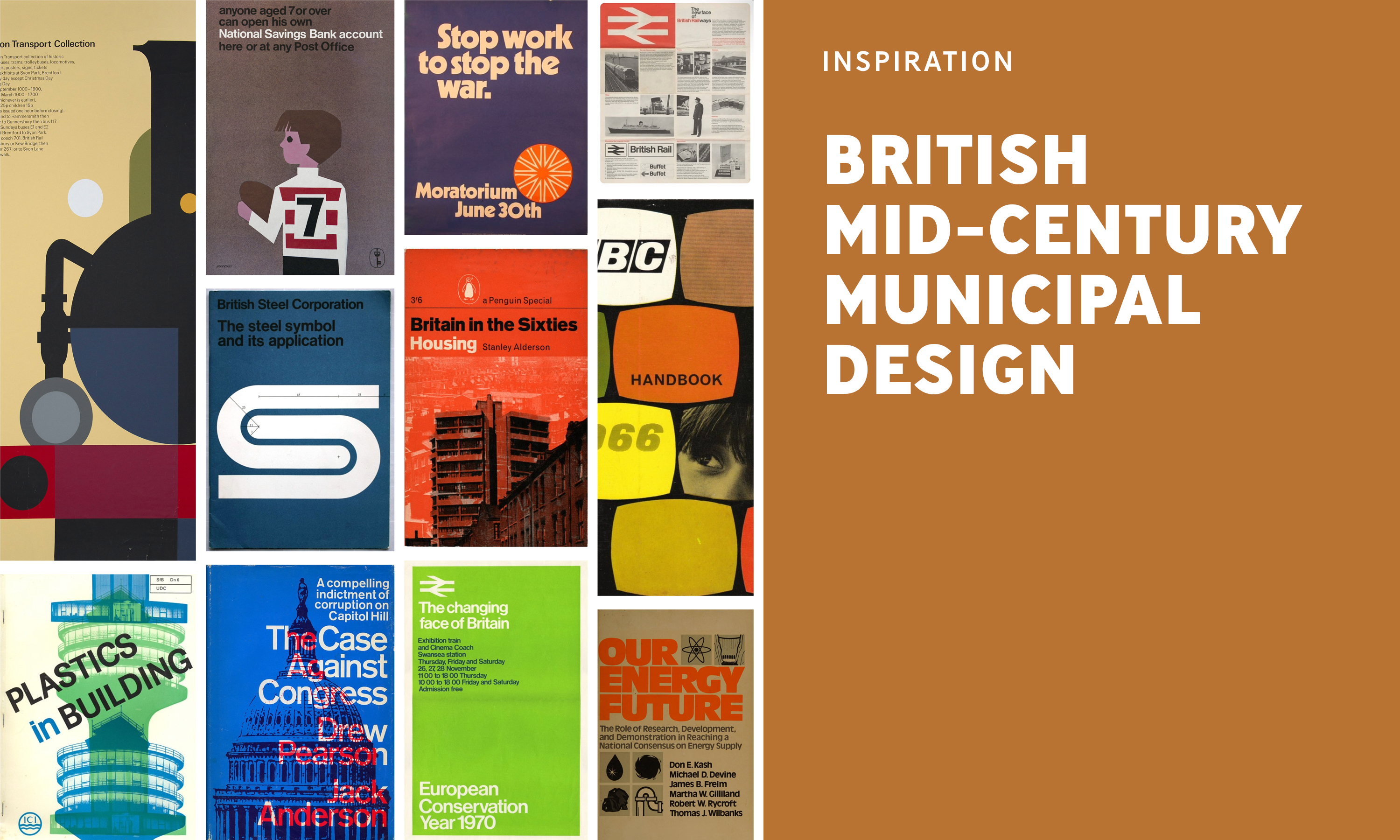
The visual identity was developed around the idea of a public information service, borrowing from the graphic language of municipal signage, government publications and civic wayfinding. This deliberately official aesthetic is used in a slightly tongue-in-cheek way, giving the project a distinctive personality while reinforcing its purpose as a practical, accessible public resource.
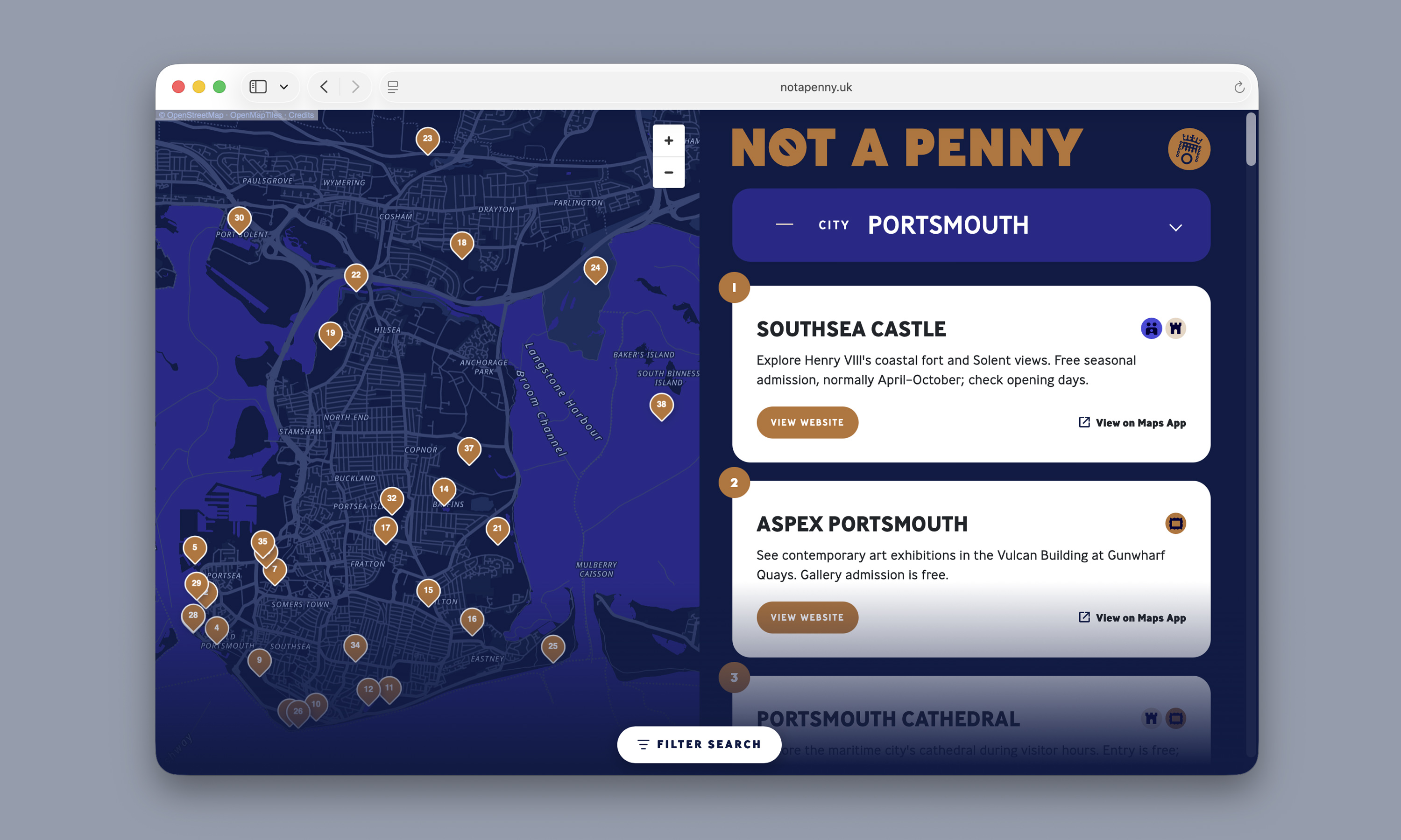
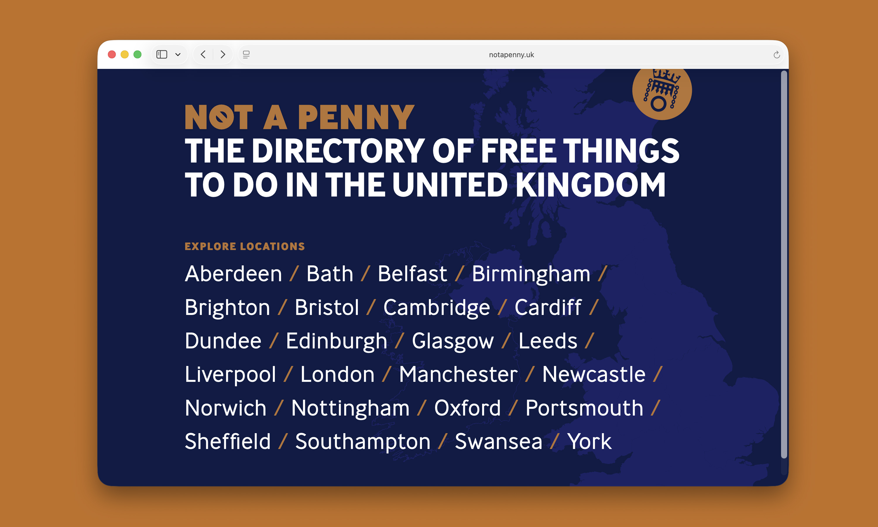
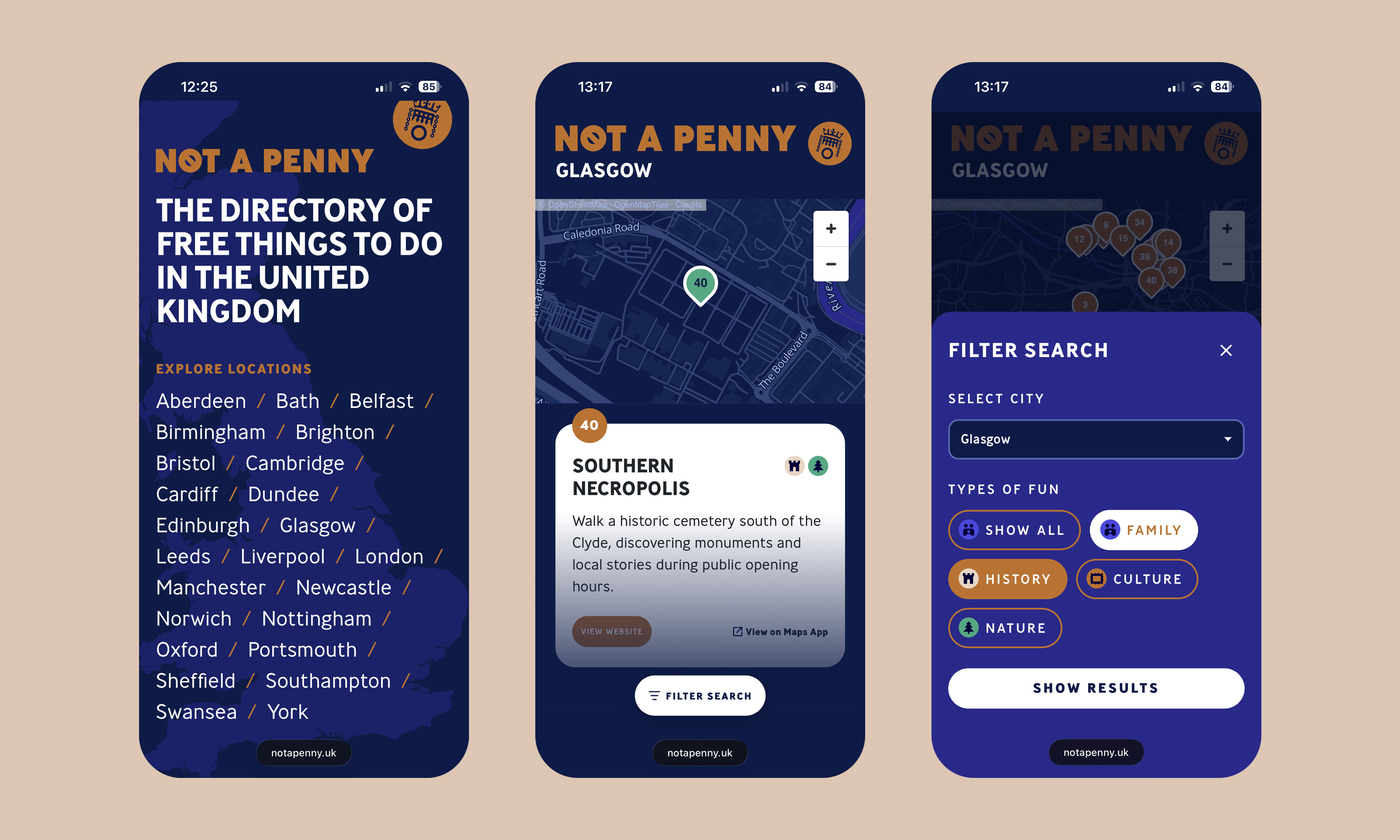
The website and UI extend this approach through a clear, functional interface designed to make discovery as simple as possible. City-based pages combine interactive maps with browsable listings and straightforward filtering, allowing users to quickly find relevant activities and understand where they are located. Responsive layouts, prominent navigation and stripped-back controls keep the experience direct and accessible across desktop and mobile, balancing the character of the visual identity with the usability of a modern directory.

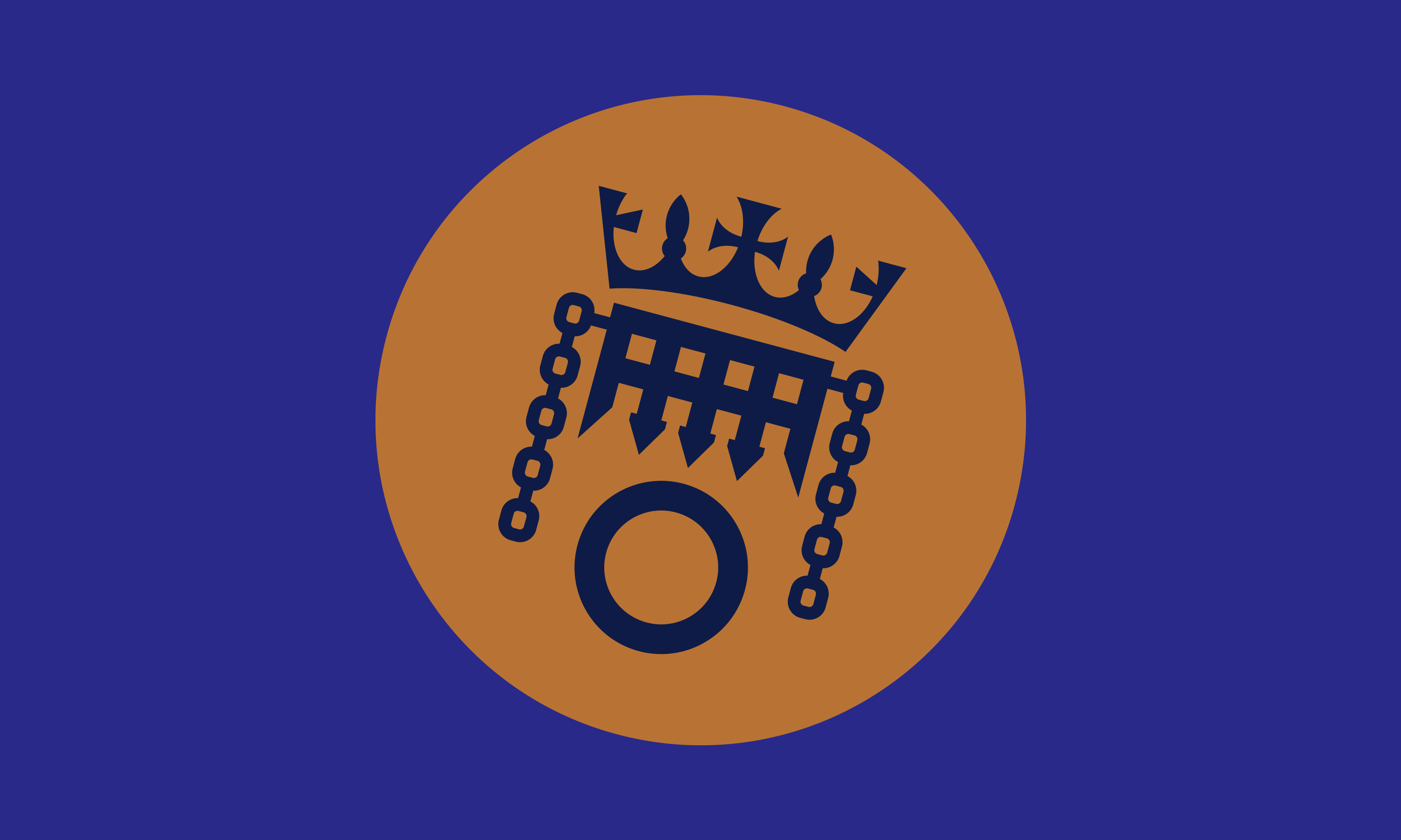
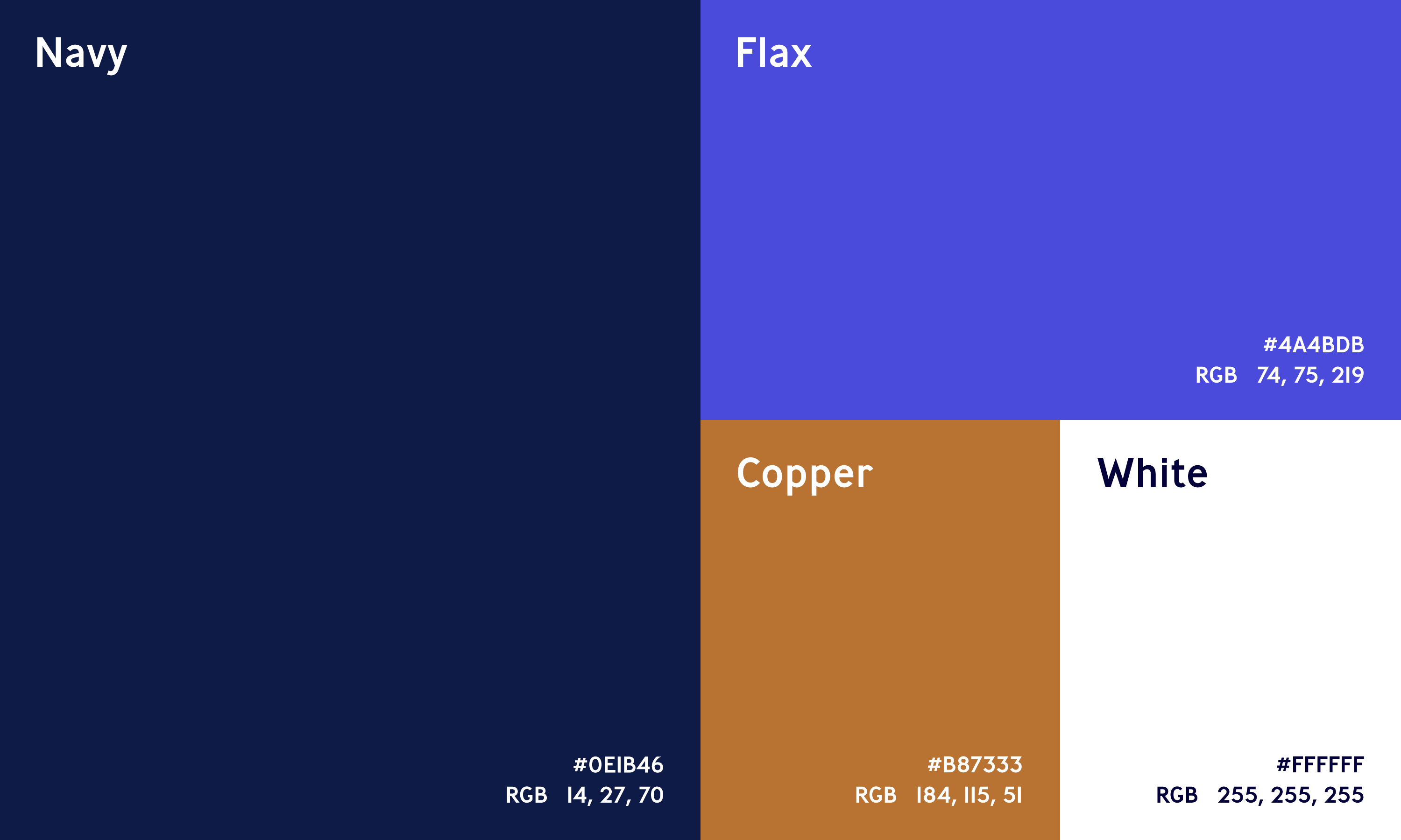
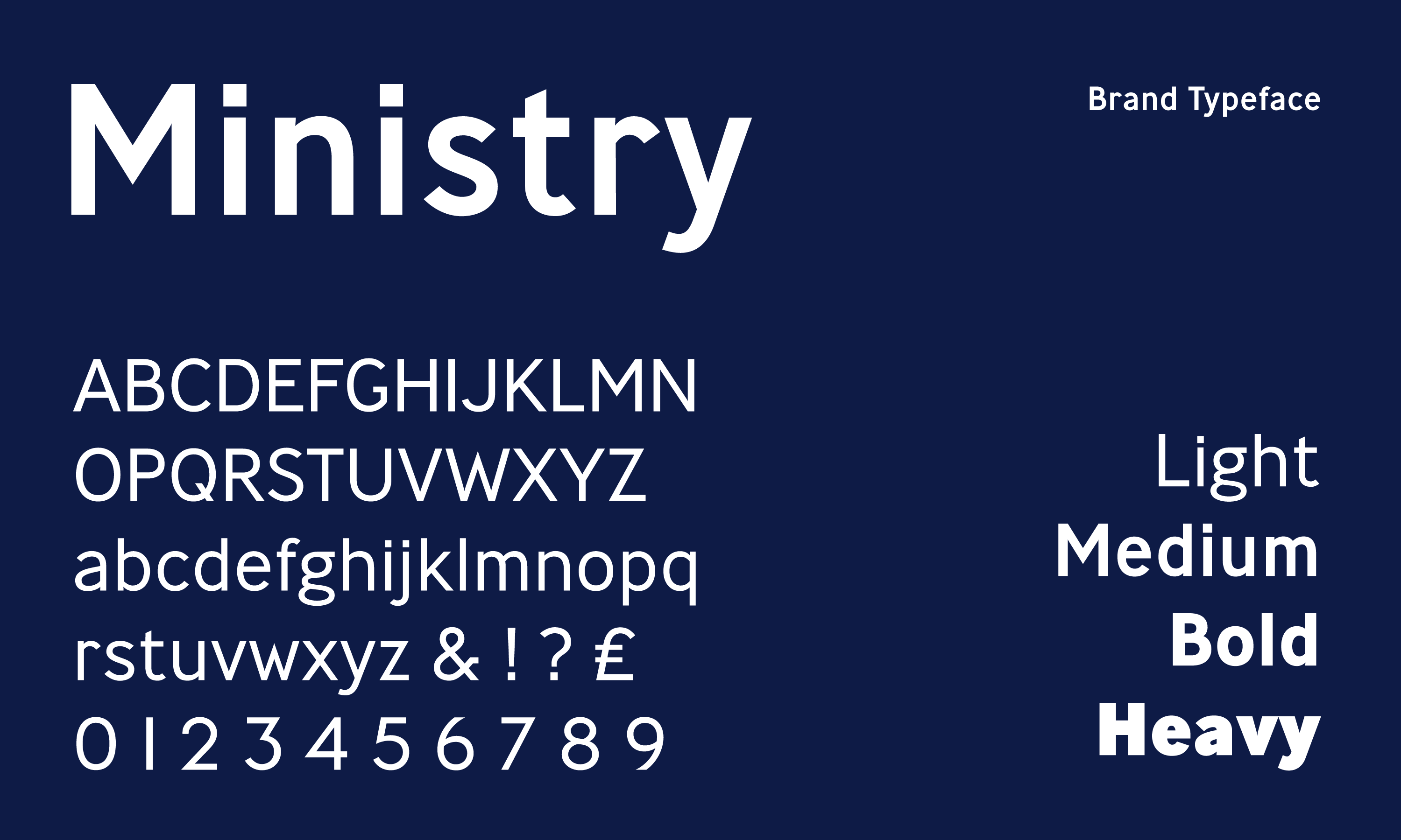
The identity takes its copper colour directly from the penny coin, which also became a central graphic symbol for the project. The portcullis depicted on the coin was reworked with its gate raised, transforming a familiar national symbol into one representing openness, access and freedom. Bold typography, a restrained colour palette and utilitarian graphics build on this idea, creating a visual system that feels both familiar and contemporary.